UXD BY JA
Uplifting the Client!
My teams goal was to help Uplift K12 retain users.
Who is Uplift K12?
Mehul and Michelle Shah are two former educators who found a gap within education that they knew could be filled. Motivated to assist in lower income schools, they wanted to bridge the gap between students just learning and being able to captivate the students while they learn.
They decided to put together a website that is full of games, but are all educational and available to be instructor led, virtual or within the classroom.
Project Scope
Client: Uplift K12 Group Client Project
Time Constraint: 4 week sprint
Role: Product Designer
Problem: User retention issues
Tools/ Software used: Figma, Google Drive, Google Analytics, Trello, Maze, WebAIM
.png)
1
2
3
1
.png)
Why did Uplift K12 need help?
Mehul let us know that they are having trouble retaining users. They would use various forms of social media to promote their product, they would get a ton of hits, but no one would return the following day.
.png)
Business Goal
Mehul's business goal was to increase user retention by 10%. Taking a look at their google analytics, the spikes are when they create a post on their social media and the dips are the following days. With an average interaction rate of just over one minute, there's a road block somewhere.
Staring the research...
Noticing that users were engaging with the website for such a short time and not coming back definitely lead us to believe there was a roadblock near the beginning of the site. To help uncover the issues my team and I conducted:
-
Current site moderated usability testing
-
Heuristic Evaluation
-
Competitive and Comparative Analysis
-
User Interviews and surveys
Moderated Usability Testing
We had 3 users go through the site to give us a better understanding of the state and flow of the site, we found out that:
-
Without paying for a subscription, you could only try out 5 games before it wouldn't let you test anymore. There also wasn't any easy way to remove a game to try out another.
-
The flow of the site between pages was extremely confusing. There was no system status to allow you to retrace your steps.
-
A lot of the sites buttons and call to action elements were confusing. The button you would use to play a game was labeled "Launch", which caused confusion.
Heuristic Evaluation
The Heuristic Evaluation is traditionally either a pass or fail, but to help distinguish between which elements were to be addressed as a priority they were rated between 0 and 4. 0 being no violations, 4 being labeled a catastrophe and needing to be addressed immediately. The following Heuristics were in violation:

Match between system and the real world - 4
"Launch" button instead of "Play", "Import from Library" instead of "Back to Games".

Recognition rather than recall - 4
When navigating the site between misleading icons and call to action buttons not matching the real world, confusion leads to users getting lost and unable to recall certain paths. Trial and error ends up being the only way to navigate.
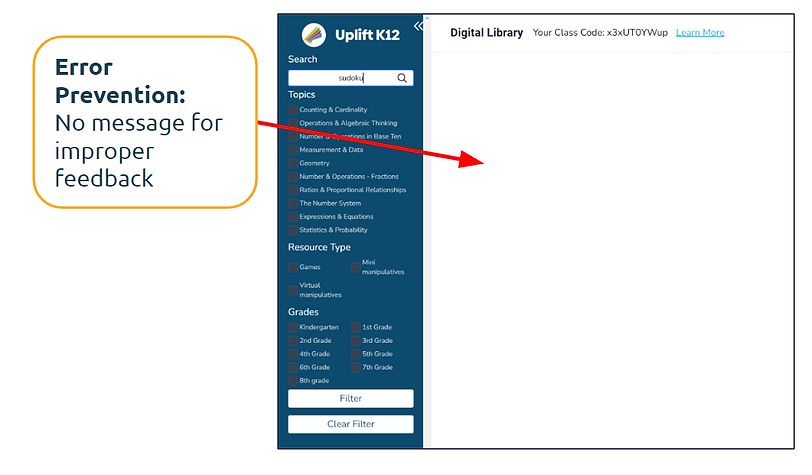
Error prevention - 3
When entering inaccurate searches, there's no error or any kind of indication that a mistake was inputted.
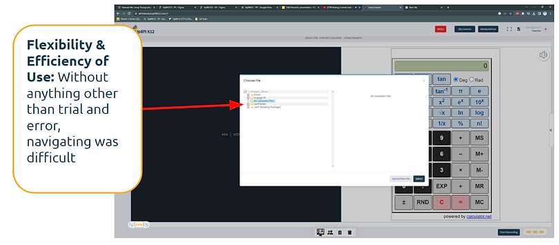
Flexibility and Efficiency of use - 3
Trial and error ends up being the only option to figure out what does what.

Help and documentation - 3
Instructions for certain games are long and confusing. There's a demo of one game that's supposed to be a "Tour", but it doesn't help users with learning how to navigate the site.
C&C Analysis
To help uncover what competitors were doing that allowed them to succeed early in the research phase was very insightful. Websites put under the scope as well as the key takeaways were:
The ability to choose games based on grade and a specific skill.
Able to preplan lessons throughout the week to stay organized and on top of lesson plans.
Engaging games with cartoon characters kids know, games based on topic and parental control options.
.png)
User Interviews & Surverys
Just from the processes earlier, we had a better understanding of the issues within the site, but after asking 5 users specific questions of how they felt we discovered even more.
"I feel like navigating the site is confusing. I can't find some of the things I need quickly."
"I want a more personalized experience when signing up."
"I want games that align with my curriculum."
"I wish the site was easier to navigate so that I could complete tasks."
"I wish there was an easier way to filter for games that I'm looking for."
2
Synthesizing the Data...
The user feedback we got was very eye-opening and clear. After updating the client with our findings, the next steps were:
-
Creating a User Persona
-
How might we's
-
Problem Statement
User Persona
Since Uplift K12 was a virtual teaching tool, we had more than one prospective user. We had two. A teacher that is in person as well as virtual.

.png)
Meet Carol and Dylan!
Carol:
A virtual teacher who wants more convenience and ease of use to encourage further engagement while using virtual teaching tools. Also wants to spend more of her energy on creating a fun environment to interact with her students and less time on planning.
She needs suggested games and tools to use in her lessons to save her time. She needs an efficient and simple design to help her navigate the site.
Problem Statement:
Carol, a virtual math teacher, is having difficulty utilizing UpliftK12 resources in her lessons due to the lack of personalized recommendations. The absence of tailored suggestions on the website forces Carol to spend excessive time searching for relevant games, hindering her teaching efficiency.
How might we:
How might we enhance the personalization of UpliftK12's resources to provide Carol with tailored recommendations, allowing her to align her experience with her teaching goals and lesson plans?
Dylan:
Dylan is an in classroom teacher who believes kids learn best through play. He wants his students to stay motivated and keep them engaged while they learn, so what better way to learn than by playing fun games?
Dylan needs to have content streamlined to him to make sure he's helping his students as much as possible. He needs navigation to be intuitive and quick since he doesn't have endless time to plan his activities in advance. He needs instructions of how to make the most out of a virtual teaching tool to keep his students engaged.
Problem Statement:
Dylan, an educator in a classroom setting, aims to boost student engagement by incorporating an online math game website. However, he struggles with the setup process and efficient utilization of the website's features. This leads to time-consuming and confusing experiences, hampering Dylan's ability to seamlessly integrate the site into his teaching methodology.
How might we:
How might we design for an experience that enhances student engagement and seamlessly integrates Dylan's teaching methods, allowing him to easily incorporate the site into his classroom activities?
3
User-centered Design!
Before getting into designing a critical error had occurred to me... Uplift K12's website didn't have a homepage that made sense for users. Before my team and I continued, I created a sitemap of the current site in Figjam to display the contents of the site as simply as possible to figure out how to aid in giving the site better flow.

I wanted to keep it in as close to the same orientation as possible, so since the website had side-bar navigation, I displayed it that way.
We quickly realized this didn't work so I rearranged the websites content to ensure users were able to navigate with efficiency.

Now that my team and I have a better visualization of what the website should look like at its core, we're able to continue our design process as follows:
-
Sketching
-
Gray-scale wireframing, prototyping and testing
-
Hi-fi wireframing, prototyping and testing
Sketching our ideas!

My team and I all had some pretty good ideas that for the most part fell within the same scope, our users goals were clear to us and we want to make sure that users had:
-
Tutorials and more tutorials!
-
Ability to create a class during the signup process or to revisit it later.
-
Able to select your classes grade and have games catered towards you for personalization.
-
As well as the ability to create multiple classes. Not all teachers only have one class, so this allows for more customization!
Gray scale wireframing, prototyping and testing!

Here you can see the new and improved homepage, with the information architecture properly in place, users are sure to be able to navigate the website with ease.

This wireframe is showcasing how users would now be able to create a class, select the grade and add students with auto-generated passwords to join the virtual classroom.
Lets put it to the test!
After conducting 3 moderated usability tests, we received some positive feedback!
1. 3/3 users thought the sign-up process was intuitive and helpful!
"I think the sign-up process is pretty straight forward!"
2. 3/3 users found the platforms interface to be intuitive and easy to navigate, leading to a positive overall experience!
3. 3/3 users liked the option of the whiteboard for interactive teaching activities contributing to a more engaging learning experience!
Hi-fi wireframes, prototype and testing!
Above is a screen recording of the sites original "Game Library", it had all the filters on the side and all of the games listed on the same page. There are over 450 games.
To better organize the games and make the content easier to digest for users we decided to arrange the games page like this...
.png)
With new and improved information architecture the content is streamlined and easy to digest for users!
Hi-fi prototype testing!
8 unmoderated usability tests were done using maze. Our tasks assigned were:
1. Create an Account
-
100% success rate!
-
Average of 39 seconds to complete the task!
2. Create a class page and add your students
-
6/8 users had a direct success!
-
Average of 30 seconds completing the task!
"Everything makes sense! The UI looks amazing!"
3. Open up a virtual classroom, open a whiteboard and add two students from a class
-
6/8 users had a direct success!
-
Average of 29 seconds to complete the task!
"The platform is attractive and seems largely functional!"
"The website design looks friendly and fits with the overall theme of education!"
"It fits the theme and purpose!"
Future Development
At the beginning of this project, one of the original business goals our client wanted to achieve was to audit 250 games. We were able to audit 50 of the before deciding that we needed to shift our priorities.
If we were to work on this again in the future we would want to work on an overall theme within the games to make the website have an overall theme that consists throughout. As well as making sure all games are fully functional, accessible and also adding in voiced over tutorials for the games to eliminate the need to read a set of instructions before being able to play.
We would also like integrate State Educational Standards to make sure students are consuming core value content and also make sure games are aligned with the schools curriculum. Doing that would make sure teachers are engaging with students in an innovative way, but also making sure their consuming the same content out their "textbooks".
Another feature would be to add in a parent portal. If students were to be graded, scored, or anything along those lines, parents would be able to log into Uplift K12 and stay up to date with potential grades, interactions their students have had throughout the week and future lesson plans. Just overall stay involved with their little ones success!
Take Aways
For this to have been my first interaction with a client, Mehul and Michelle, I couldn't have asked for a better client. I understood their story and immediately empathized with them and wanted to nail this project.
Mehul and Michelle were very understanding of the process and had to change their focus at times and they were very accepting. At the start they knew they had a problem, had spent hours and hours putting together their website and felt defeated that they weren't gaining any traction. They felt like they needed to ask as many people as possible why they stopped using the website. At first they wanted 25 user interviews, at least! 250 game audits and said they didn't care about everything else in between because they did so much work to create what they already had.
After going through the Heuristic Evaluation with them they started to see problems without even having user feedback yet, so that allowed them to realize that 25 user interviews was a little excessive. As for the 250 game audits, my team and I were getting to a point where we knew we wouldn't have been able to execute a product we'd be proud of if we continued down a path that was counter productive for our scope of work.
With a bit of a pivot or two, we were able to deliver a solid product that got solid usability results and Mehul and Michelle were very thankful.
All of the hours spent on this project from start to finish were worth the last 30 seconds, the appreciation. I'm very thankful and I wish them success!